This short tutorial is meant for people who want to start using
CSS and have never written a CSS style sheet before.
It does not explain much of CSS. It just explains how to create an
HTML file, a CSS file and how to make them work together. After
that, you can read any of a number of
other
tutorials to add more features to the HTML and CSS files. Or you
can switch to using a dedicated
HTML or CSS editor, that helps
you set up complex sites.
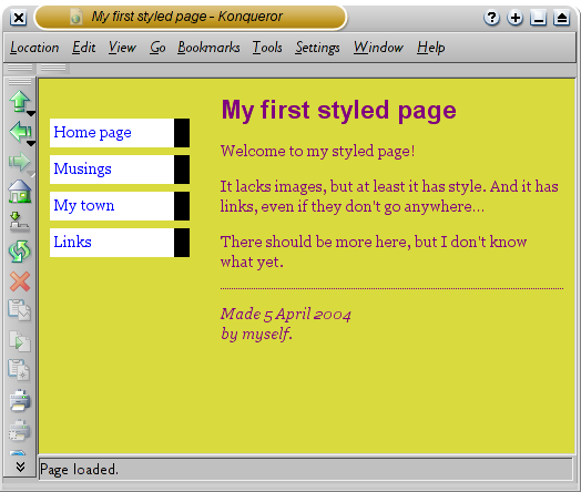
At the end of the tutorial, you will have made an HTML file that
looks like this:
The resulting HTML page, with colors and layout, all done with
CSS.
Note that I don't claim that this is beautiful ☺

Sections
that look like this are
optional. They contain some extra
explanation of the HTML and CSS codes in the example. The
“alert!” sign at the start indicates that this is more advanced
material than the rest of the text.
Step 1: writing the HTML
For this tutorial, I suggest you use only the very simplest of
tools. E.g., Notepad (under Windows), TextEdit (on the Mac) or
KEdit (under KDE) will do fine. Once you understand the principles,
you may want to switch to more advanced tools, or even to
commercial programs, such as Style Master, Dreamweaver or GoLive.
But for your very first CSS style sheet, it is good not to be
distracted by too many advanced features.
Don't use a wordprocessor, such as Microsoft Word or OpenOffice.
They typically make files that a Web browser cannot read. For HTML
and CSS, we want simple, plain text files.
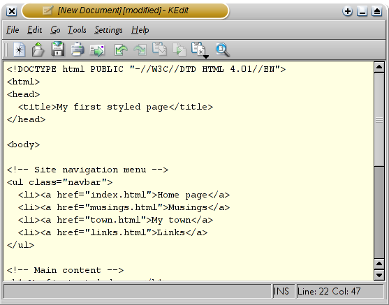
Step 1 is to open your text editor (Notepad, TextEdit, KEdit, or
whatever is your favorite), start with an empty window and type the
following:
<!DOCTYPE html PUBLIC "-//W3C//DTD HTML 4.01//EN">
<html>
<head>
<title>My first styled page</title>
</head>
<body>
<!-- Site navigation menu -->
<ul class="navbar">
<li><a href="index.html">Home page</a>
<li><a href="musings.html">Musings</a>
<li><a href="town.html">My town</a>
<li><a href="links.html">Links</a>
</ul>
<!-- Main content -->
<h1>My first styled page</h1>
<p>Welcome to my styled page!
<p>It lacks images, but at least it has style.
And it has links, even if they don't go
anywhere…
<p>There should be more here, but I don't know
what yet.
<!-- Sign and date the page, it's only polite! -->
<address>Made 5 April 2004<br>
by myself.</address>
</body>
</html>
In fact, you don't have to type it: you can copy and paste it
from this Web page into the editor.
(If you are using TextEdit on the Mac, don't forget to tell
TextEdit that the text is really plain text, by going to the Format
menu and selecting “Make plain text”.)
The first
line of the HTML file above tells the browser which type of HTML
this is (DOCTYPE means DOCument TYPE). In this case, it is HTML
version 4.01.
Words within < and > are called
tags and, as you
can see, the document is contained within the <html> and
</html> tags. Between <head> and </head> there
is room for various kinds of information that is not shown on
screen. So far it contains the title of the document, but later we
will add the CSS style sheet there, too.
The <body> is where the actual text of the document goes.
In principle, everything in there will be displayed, except for
the the text inside <!-- and -->, which serves as a comment
to ourselves. The browser will ignore it.
Of the tags in the example, <ul> introduces an
“Unordered List”, i.e., a list in which the items are not
numbered. The <li> is the start of a “List Item.” The
<p> is a “Paragraph.” And the <a> is an
“Anchor,” which is what creates a hyperlink.
If you
want to know what the names in <…> mean, one good place to
start is
Getting started with HTML. But just a
few words about the structure of our example HTML page.
- The “ul” is a list with one hyperlink per item. This will
serve as our “site navigation menu,” linking to the other
pages of our (hypothetical) Web site. Presumably, all pages on
our site have a similar menu.
- The “h1” and “p” elements form the unique content of
this page, while the signature at the bottom (“address”) will
again be similar on all pages of the site.
Note that I didn't close the “li” and “p” elements. In
HTML (but not in XHTML), it is allowed to omit the </li> and
</p> tags, which I did here, to make the text a little
easier to read. But you may add them, if you prefer.
Let's assume that this is going to be one page of a Web site with
several similar pages. As is common for current Web pages, this one
has a menu that links to other pages on the hypothetical site, some
unique content and a signature.
Now select “Save As…” from the File menu, navigate to a
directory/folder where you want to put it (the Desktop is fine) and
save the file as “mypage.html”. Don't close the editor yet, we
will need it again.
(If you are using TextEdit on Mac OS X before version 10.4, you
will see an option Don't append the .txt extension in the Save as
dialog. Select that option, because the name “mypage.html”
already includes an extension. Newer versions of TextEdit will
notice the .html extension automatically.)
Next, open the file in a browser. You can do that as follows:
find the file with your file manager (Windows Explorer, Finder or
Konqueror) and click or double click the “mypage.html” file. It
should open in your default Web browser. (If it does not, open your
browser and drag the file to it.)
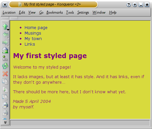
As you can see, the page looks rather boring…
Step 2: adding some colors
You probably see some black text on a white background, but it
depends on how the browser is configured. So one easy thing we can
do to make the page more stylish is to add some colors. (Leave the
browser open, we will use it again later.)
We will start with a style sheet embedded inside the HTML file.
Later, we will put the HTML and the CSS in separate files. Separate
files is good, since it makes it easier to use the same style sheet
for multiple HTML files: you only have to write the style sheet
once. But for this step, we just keep everything in one file.
We need to add a <style> element to the HTML file. The
style sheet will be inside that element. So go back to the editor
window and add the following five lines in the head part of the
HTML file. The lines to add are shown in red.
<!DOCTYPE html PUBLIC "-//W3C//DTD HTML 4.01//EN">
<html>
<head>
  <title>My first styled page</title>
  <style type="text/css">
  body {
    color: purple;
    background-color: #d8da3d }
  </style>
</head>

<body>
[etc.]
The first line says that this is a style sheet and that it is
written in CSS (“text/css”). The second line says that we add
style to the “body” element. The third line sets the color of
the text to purple and the next line sets the background to a sort
of greenish yellow.
Style
sheets in CSS are made up of
rules. Each rule has three
parts:
- the selector (in the example: “body”), which
tells the browser which part of the document is affected by the
rule;
- the property (in the example, 'color' and
'background-color' are both properties), which specifies what
aspect of the layout is being set;
- and the value ('purple' and '#d8da3d'), which gives
the value for the style property.
The example shows that rules can be combined. We have set two
properties, so we could have made two separate rules:
body { color: purple }
body { background-color: #d8da3d }
but since both rules affect the body, we only wrote “body”
once and put the properties and values together. For more about
selectors, see
chapter
2 of
Lie & Bos.
The background of the body element will also be the background of
the whole document. We haven't given any of the other elements (p,
li, address…) any explicit background, so by default they will
have none (or: will be transparent). The 'color' property sets the
color of the text for the body element, but all other elements
inside the body inherit that color, unless explicitly overridden.
(We will add some other colors later.)
Now save this file (use “Save” from the File menu) and go
back to the browser window. If you press the “Reload” button,
the display should change from the “boring” page to a colored
(but still rather boring) page. Apart from the list of links at the
top, the text should now be purple against a greenish yellow
background.

Colors can be
specified in CSS in several ways. This example shows two of them:
by name (“purple”) and by hexadecimal code (“#d8da3d”).
There are about 140 color names and the hexadecimal codes allow
for over 16 million colors.
Adding a touch of style explains more
about these codes.
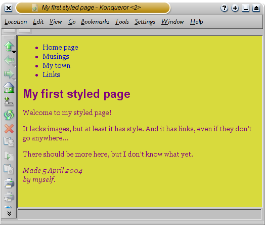
Step 3: adding fonts
Another thing that is easy to do is to make some distinction in
the fonts for the various elements of the page. So let's set the
text in the “Georgia” font, except for the h1 heading, which
we'll give “Helvetica.”
On the Web, you can never be sure what fonts your readers have on
their computers, so we add some alternatives as well: if Georgia is
not available, Times New Roman or Times are also fine, and if all
else fails, the browser may use any other font with
serifs. If Helvetica is absent, Geneva, Arial and
SunSans-Regular are quite similar in shape, and if none of these
work, the browser can choose any other font that is serif-less.
In the text editor add the following lines:
<!DOCTYPE html PUBLIC "-//W3C//DTD HTML 4.01//EN">
<html>
<head>
  <title>My first styled page</title>
  <style type="text/css">
  body {
    font-family: Georgia, "Times New Roman",
          Times, serif;
    color: purple;
    background-color: #d8da3d }
  h1 {
    font-family: Helvetica, Geneva, Arial,
          SunSans-Regular, sans-serif }
  </style>
</head>

<body>
[etc.]
If you save the file again and press “Reload” in the browser,
there should now be different fonts for the heading and the other
text.
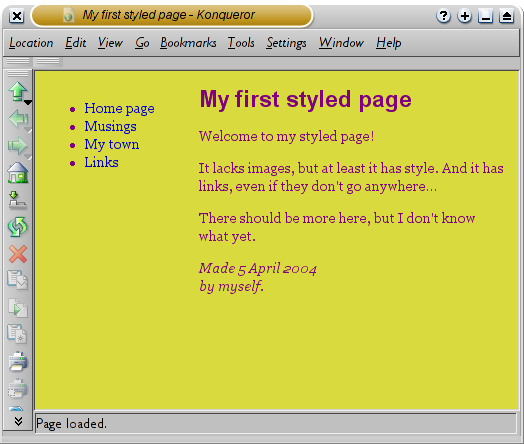
Step 4: adding a navigation bar
The list at the top of the HTML page is meant to become a
navigation menu. Many Web sites have some sort of menu along the
top or on the side of the page and this page should have one as
well. We will put it on the left side, because that is a little
more interesting than at the top…
The menu is already in the HTML page. It is the <ul> list
at the top. The links in it don't work, since our “Web site” so
far consists of only one page, but that doesn't matter now. On a
real Web site, there should not be any broken links, of course.
So we need to move the list to the left and move the rest of the
text a little to the right, to make room for it. The CSS properties
we use for that are 'padding-left' (to move the body text) and
'position', 'left' and 'top' (to move the menu).
There are other ways to do it. If you look for “column” or
“layout” on the
Learning CSS page, you will find
several ready-to-run templates. But this one is OK for our
purposes.
In the editor window, add the following lines to the HTML
file:
<!DOCTYPE html PUBLIC "-//W3C//DTD HTML 4.01//EN">
<html>
<head>
  <title>My first styled page</title>
  <style type="text/css">
  body {
    padding-left: 11em;
    font-family: Georgia, "Times New Roman",
          Times, serif;
    color: purple;
    background-color: #d8da3d }
  ul.navbar {
    position: absolute;
    top: 2em;
    left: 1em;
    width: 9em }
  h1 {
    font-family: Helvetica, Geneva, Arial,
          SunSans-Regular, sans-serif }
  </style>
</head>

<body>
[etc.]
If you save the file again and reload it in the browser, you
should now have the list of links to the left of the main text.
That already looks much more interesting, doesn't it?
The
'position: absolute' says that the ul element is positioned
independently of any text that comes before or after it in the
document and the 'left' and 'top' indicate what that position is.
In this case, 2em from the top and 1em from the left side of the
window.
'2em' means 2 times the size of the current font. E.g., if the
menu is displayed with a font of 12 points, then '2em' is 24
points. The 'em' is a very useful unit in CSS, since it can adapt
automatically to the font that the reader happens to use. Most
browsers have a menu for increasing or decreasing the font size:
you can try it and see that the menu increases in size as the font
increases, which would not have been the case, if we had used a
size in pixels instead.
Step 5: Styling the links
The navigation menu still looks like a list, instead of a menu.
Let's add some style to it. We'll remove the list bullet and move
the items to the left, to where the bullet was. We'll also give
each item its own white background and a black square. (Why? No
particular reason, just because we can.)
We also haven't said what the colors of the links should be, so
let's add that as well: blue for links that the user hasn't seen
yet and purple for links already visited:
<!DOCTYPE html PUBLIC "-//W3C//DTD HTML 4.01//EN">
<html>
<head>
  <title>My first styled page</title>
  <style type="text/css">
  body {
    padding-left: 11em;
    font-family: Georgia, "Times New Roman",
          Times, serif;
    color: purple;
    background-color: #d8da3d }
  ul.navbar {
    list-style-type: none;
    padding: 0;
    margin: 0;
    position: absolute;
    top: 2em;
    left: 1em;
    width: 9em }
  h1 {
    font-family: Helvetica, Geneva, Arial,
          SunSans-Regular, sans-serif }
  ul.navbar li {
    background: white;
    margin: 0.5em 0;
    padding: 0.3em;
    border-right: 1em solid black }
  ul.navbar a {
    text-decoration: none }
  a:link {
    color: blue }
  a:visited {
    color: purple }
  </style>
</head>

<body>
[etc.]
Traditionally, browsers show hyperlinks with underlines and with
colors. Usually, the colors are similar to what we specificed
here: blue for links to pages that you haven't visited yet (or
visited a long time ago), purple for pages that you have already
seen.
In HTML, hyperlinks are created with <a> elements, so to
specify the color, we need to add a style rule for “a”. To
differentiate between visited and unvisited links, CSS provides
two “pseudo-classes” (:link and :visited). They are called
“pseudo-classes” to distinguish them from class
attributes, that appear in the HTML directly, e.g., the
class="navbar" in our example.
Step 6: adding a horizontal line
The final addition to the style sheet is a horizontal rule to
separate the text from the signature at the bottom. We will use
'border-top' to add a dotted line above the <address>
element:
<!DOCTYPE html PUBLIC "-//W3C//DTD HTML 4.01//EN">
<html>
<head>
  <title>My first styled page</title>
  <style type="text/css">
  body {
    padding-left: 11em;
    font-family: Georgia, "Times New Roman",
          Times, serif;
    color: purple;
    background-color: #d8da3d }
  ul.navbar {
    list-style-type: none;
    padding: 0;
    margin: 0;
    position: absolute;
    top: 2em;
    left: 1em;
    width: 9em }
  h1 {
    font-family: Helvetica, Geneva, Arial,
          SunSans-Regular, sans-serif }
  ul.navbar li {
    background: white;
    margin: 0.5em 0;
    padding: 0.3em;
    border-right: 1em solid black }
  ul.navbar a {
    text-decoration: none }
  a:link {
    color: blue }
  a:visited {
    color: purple }
  address {
    margin-top: 1em;
    padding-top: 1em;
    border-top: thin dotted }
  </style>
</head>

<body>
[etc.]
Now our style is complete. Next, let's look at how we can put the
style sheet in a separate file, so that other pages can share the
same style.
Step 7: putting the style sheet in a separate file
We now have an HTML file with an embedded style sheet. But if our
site grows we probably want many pages to share the same style.
There is a better method than copying the style sheet into every
page: if we put the style sheet in a separate file, all pages can
point to it.
To make a style sheet file, we need to create another empty text
file. You can choose “New” from the File menu in the editor, to
create an empty window. (If you are using TextEdit, don't forget to
make it plain text again, using the Format menu.)
Then cut and paste everything that is inside the <style>
element from the HTML file into the new window. Don't copy the
<style> and </style> themselves. They belong to HTML,
not to CSS. In the new editor window, you should now have the
complete style sheet:
body {
  padding-left: 11em;
  font-family: Georgia, "Times New Roman",
        Times, serif;
  color: purple;
  background-color: #d8da3d }
ul.navbar {
  list-style-type: none;
  padding: 0;
  margin: 0;
  position: absolute;
  top: 2em;
  left: 1em;
  width: 9em }
h1 {
  font-family: Helvetica, Geneva, Arial,
        SunSans-Regular, sans-serif }
ul.navbar li {
  background: white;
  margin: 0.5em 0;
  padding: 0.3em;
  border-right: 1em solid black }
ul.navbar a {
  text-decoration: none }
a:link {
  color: blue }
a:visited {
  color: purple }
address {
  margin-top: 1em;
  padding-top: 1em;
  border-top: thin dotted }
Choose “Save As…” from the File menu, make sure that you
are in the same directory/folder as the mypage.html file, and save
the style sheet as “mystyle.css”.
Now go back to the window with the HTML code. Remove everything
from the <style> tag up to and including the </style>
tag and replace it with a <link> element, as follows:
<!DOCTYPE html PUBLIC "-//W3C//DTD HTML 4.01//EN">
<html>
<head>
  <title>My first styled page</title>
  <link rel="stylesheet" href="mystyle.css">
</head>

<body>
[etc.]
This will tell the browser that the style sheet is found in the
file called “mystyle.css” and since no directory is mentioned,
the browser will look in the same directory where it found the HTML
file.
If you save the HTML file and reload it in the browser, you
should see no change: the page is still styled the same way, but
now the style comes from an external file.
The next step is to put both files, mypage.html and mystyle.css
on your Web site. (Well, you might want to change them a bit
first…) But how to do that depends on your Internet provider.


 opposed to
  (which is shown in Arial – see the difference?).


